

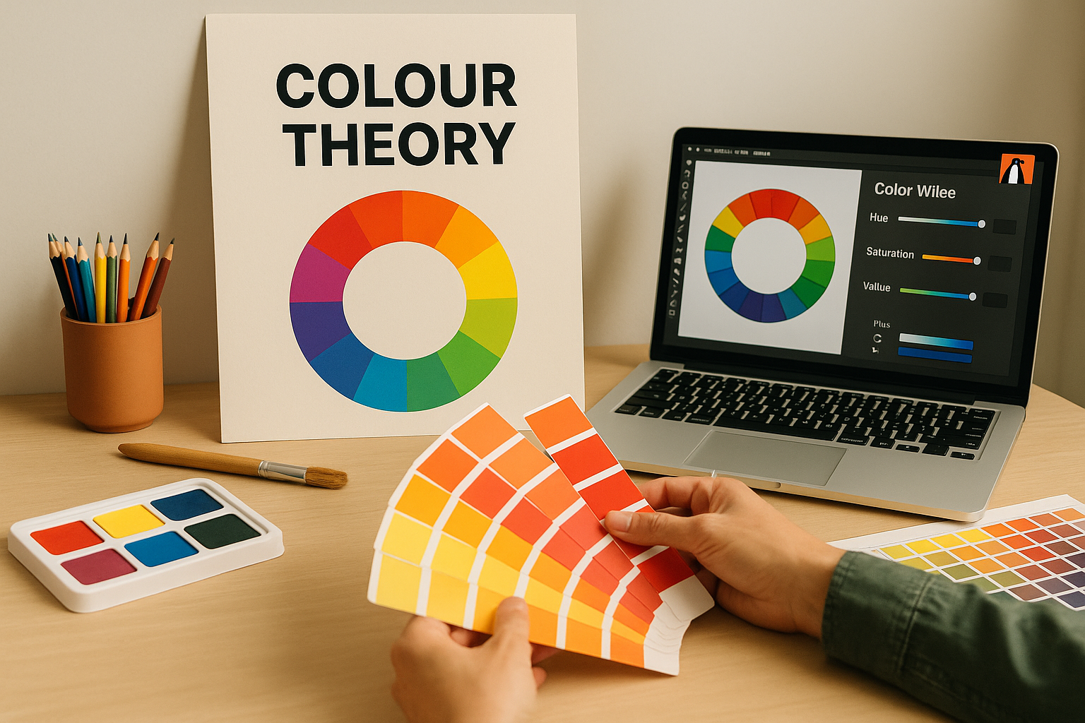
Colour Theory Insights by the Best Graphic Design Company in Vizag
Colour is the most powerful element in a designer’s toolkit. It’s not just an aesthetic choice; it’s a silent, instantaneous language that your brand speaks to the world. In the fast-paced, competitive market of Andhra Pradesh, where businesses are constantly vying for attention, relying on mere "favourite colours" is a recipe for being forgotten.
The difference between a logo that feels right and one that’s a massive success often comes down to the strategic application of colour theory. This theory is the science and art of using colour to achieve a desired visual and emotional effect.
This comprehensive guide will demystify colour theory, breaking down the essential principles used by expert creatives to build powerful, memorable brands. When you understand these concepts, you understand why a professional team like the best graphic designing company in Vizag doesn't just "make things pretty," they craft visual strategy. Mastery of these principles is how we move your brand’s visuals "From Hue to Hero."
Understanding the Colour Wheel
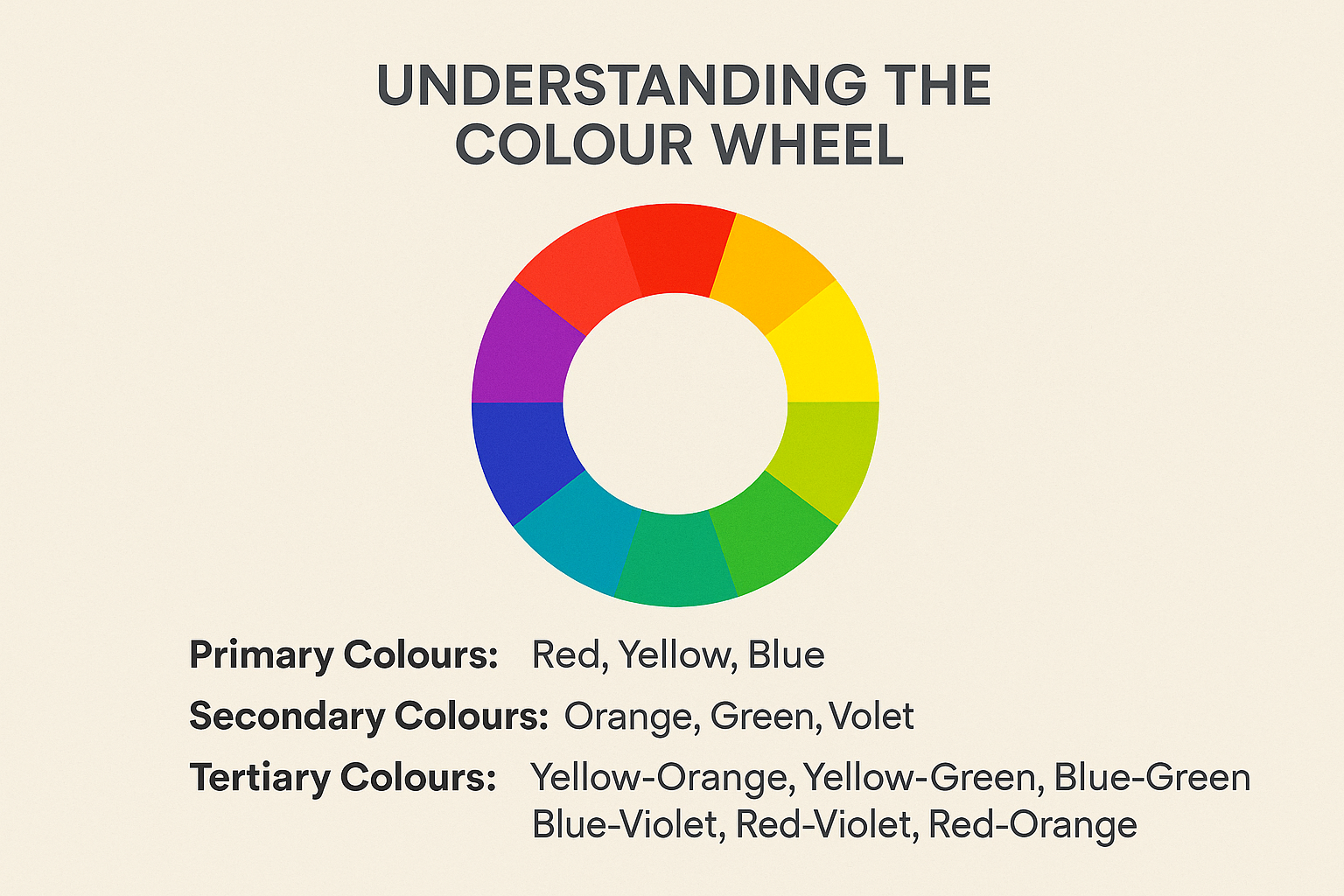
Before you can mix, you must map. The foundation of all colour theory is the colour wheel, an organizational chart that visually represents the relationships between colours.
1. The Three Categories of Colour
All colours on the wheel fall into three distinct groups:
Primary Colours (Red, Yellow, Blue): These are the atomic elements of colour. They cannot be created by mixing other colours. They form the base of every palette.
Secondary Colours (Orange, Green, Violet): These are created by mixing two primary colours (e.g., Red + Yellow = Orange).
Tertiary Colours: These are created by mixing a primary colour with an adjacent secondary colour (e.g., Yellow + Green = Yellow-Green). These shades are vital for creating sophisticated, nuanced palettes.
2. The Anatomy of Colour: HSB
While the colour wheel organizes placement, we need three core properties to truly describe and manipulate any colour. This is known as the HSB (or sometimes HSV) model:
Hue: This is the pure colour, essentially its name (red, blue, green). Think of it as the starting point on the colour wheel.
Saturation (Chroma): This describes the intensity or purity of the colour. A high saturation colour is vivid and bright; a low saturation colour is muted or dull, closer to gray. High saturation is attention-grabbing; low saturation is calming.
Value (Luminosity): This refers to the lightness or darkness of the colour. Adding white creates a tint (higher value); adding black creates a shade (lower value). Value is the single most crucial factor for creating contrast and ensuring accessibility.
A truly successful design isn't just about picking the right hue; it's about expertly controlling the saturation and value. This level of technical finesse is what separates amateur work from the high-calibre results you expect from the best graphic designing company in Vizag. They don't just pick "blue"; they select a specific hue of blue, at a precise saturation and value, to achieve a calculated effect.
Colour Harmonies
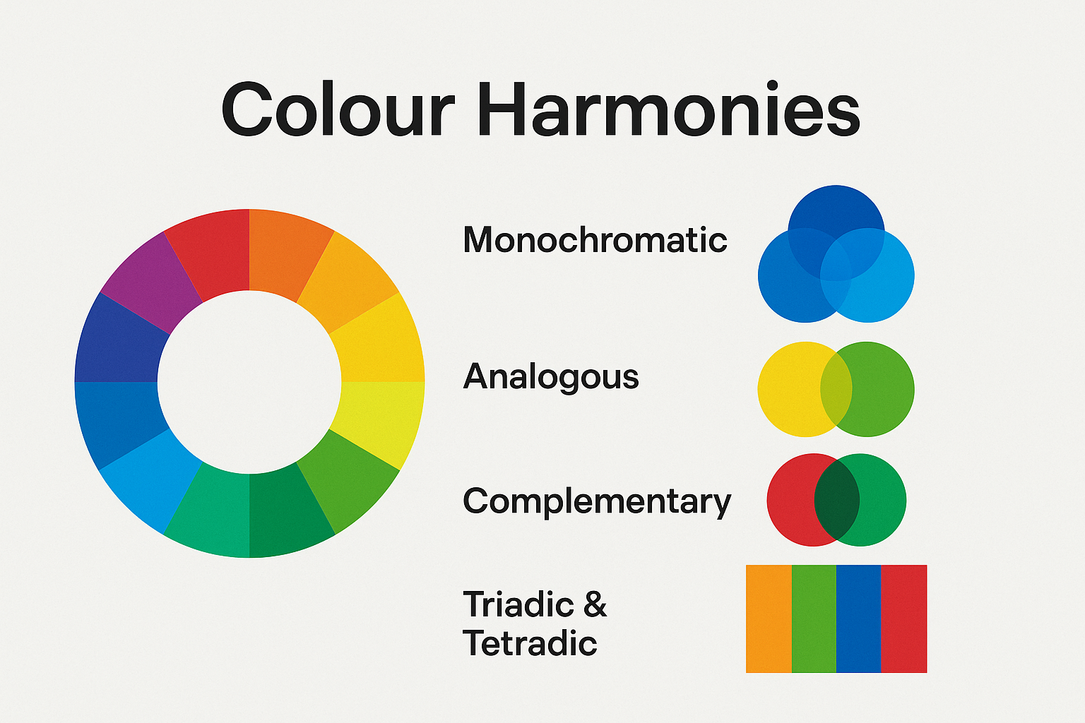
Colour harmonies, or colour schemes, are established rules for combining colours on the wheel to create visually pleasing and psychologically effective results. Ignoring these rules often results in visual chaos; mastering them guarantees aesthetic success.
1. Monochromatic Harmony (The Minimalist)
This scheme uses a single base hue and extends the palette using various tints, shades, and tones of that colour.
Vibe: Sophisticated, minimalist, cohesive, professional.
Application: Excellent for clean, corporate branding, data visualizations, and web design where the focus should be on content, not overwhelming colour.
2. Analogous Harmony (The Harmonizer)
This scheme uses two to four colours that sit directly next to each other on the colour wheel (e.g., yellow, yellow-green, and green).
Vibe: Calm, serene, natural, harmonious.
Application: Ideal for designs that need a sense of flow or natural transition, such as landscapes, health-related brands, or anything aiming to convey tranquility.
3. Complementary Harmony (The Attention-Grabber)
This scheme uses colours that sit directly opposite each other on the colour wheel (e.g., Red and Green; Blue and Orange).
Vibe: High contrast, vibrant, energetic, exciting.
Application: Perfect for calls-to-action (CTAs), warning signs, or any element that needs to pop. Because of the high intensity, professional designers use one colour as dominant and the other as a strategic accent.
4. Triadic & Tetradic Harmonies (The Complex Mixer)
Triadic: Uses three colours that are evenly spaced around the wheel (forming a perfect triangle). This provides strong contrast while maintaining colour balance and vibrancy.
Tetradic (or Double Complementary): Uses two complementary pairs (four colours) arranged in a rectangle. This is the most complex scheme, providing the richest and most diverse palette, but also the hardest to balance. It’s often used by agencies, like the one you might hire, because managing four colours requires a deliberate strategy and a deep understanding of visual weight a key skill of any best graphic designing company in Vizag.
The Psychology of Shade
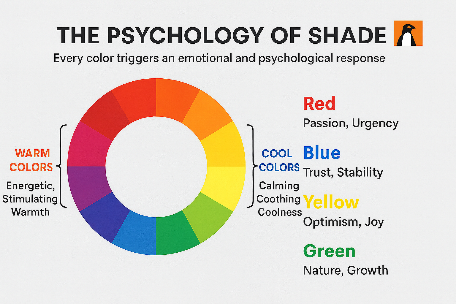
Every colour triggers a subconscious emotional and psychological response in the viewer. A skilled graphic designer leverages this inherent meaning to communicate a brand’s values instantly.
1. Warm vs. Cool Colours
The colour wheel is divided into two halves:
Warm Colours (Reds, Oranges, Yellows): These colours are energetic, stimulating, and associated with heat, fire, and sunshine. They tend to advance in a design, drawing the eye first.
Cool Colours (Blues, Greens, Violets): These colours are calming, soothing, and associated with water, sky, and nature. They tend to recede in a design, providing balance and background.
2.Specific Colour Meanings in Context
Colour | Western Association | Indian & Local Market Context | Brand Use Case |
Red | Passion, urgency, danger, energy. | Auspiciousness, marriage, power, and purity. Highly prominent in branding for food and retail. | Restaurants, Sales/Promotional Banners, Energy Drinks. |
Blue | Trust, stability, professionalism, security. | Peace (like the sky or ocean), reliability, authority. Less associated with mourning than other cultures. | Tech companies, Finance, Healthcare, Government. |
Yellow | Optimism, joy, clarity, warmth, caution. | Spirituality, divinity, knowledge, and prosperity. Very powerful and visible. | Educational services, Children's products, Brands needing high visibility. |
Green | Nature, growth, health, wealth, money. | Fertility, prosperity, and connection to the earth. Highly positive for lifestyle brands. | Eco-friendly products, Wellness centers, Real Estate. |
Black | Sophistication, power, elegance, luxury. | Authority, often used with gold/silver to convey premium quality. | Luxury fashion, High-end technology, Exclusive services. |
When designing for the local business ecosystem—whether you're operating in Vijayawada or looking for the best graphic designing company in Vizag it’s crucial to understand these cultural nuances. A luxury brand in this region might rely heavily on Black and Gold for opulence, while a local fresh food chain might focus on Green and Orange to signal freshness and vitality. Psychology is the bridge between colour choice and customer response.
Visual Hierarchy and Accessibility
Colour theory isn’t just about making things look nice; it’s about making them functional and effective. Professional graphic designers use colour to guide the user’s eye and ensure the message is clear to everyone.
1. Creating Visual Hierarchy
Visual hierarchy is the arrangement of design elements in order of importance. Colour is its most powerful tool.
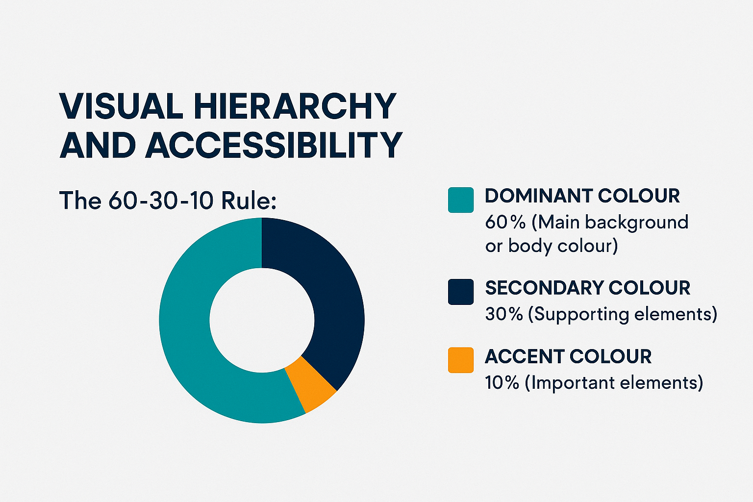
The 60-30-10 Rule: This classic interior design rule is highly effective in graphic design.
60% (Dominant Colour): The main background or body colour. It sets the overall mood.
30% (Secondary Colour): Used for supporting elements, subheadings, and key graphics.
10% (Accent Colour): Usually the complementary or most vibrant colour, reserved only for the most important elements, such as Call-to-Action (CTA) buttons or essential data points.
By reserving a high-contrast accent colour for the CTA, the designer ensures the user knows exactly where to click, increasing conversion rates.
2. Colour and Accessibility (WCAG Standards)
A great design is accessible to all. The World Content Accessibility Guidelines (WCAG) provide standards for minimum contrast ratio between text and background colours.
Contrast is Key: If the colour value difference between text and its background is too small (e.g., light gray text on a white background), people with vision impairments or even those viewing the design on a low-quality screen will struggle to read it.
Professional Expertise: A professional firm will use digital tools to check these ratios, ensuring all text meets the AA or AAA WCAG standard. This technical expertise is why investing in the best graphic designing company in Vizag is an investment in quality and compliance.
From Screen to Print

The colours you see on your monitor are not the same colours that will appear on a printed brochure or billboard. This distinction is critical and often trips up inexperienced designers.
1. RGB (Red, Green, Blue)
System: Additive Colour.
Use Case: Digital screens (websites, social media, apps).
Mechanism: Light is emitted from the screen. When Red, Green, and Blue light are combined at full intensity, the result is white.
2. CMYK (Cyan, Magenta, Yellow, Key/Black)
System: Subtractive Colour.
Use Case: Professional printing (brochures, packaging, banners).
Mechanism: Pigments (ink) are laid on white paper. The inks absorb ("subtract") light. When Cyan, Magenta, and Yellow are combined, the result is theoretically black (though in practice, black ink, or Key, is added for a true, deep black).
If a brand uses a vibrant, high-saturation RGB colour on their website, they need to know that this same colour will be duller when translated to CMYK for a print advertisement. Colour translation and management are complex technical skills that are essential for cohesive multi-channel branding.
3. Spot Colours (Pantone)
For maximum brand accuracy, designers often specify Pantone (PMS) Spot Colours. These are standardized, pre-mixed inks (like a tin of custom paint) used for a precise, guaranteed colour match across different materials. For brands with high-value logos (like Coca-Cola Red or Cadbury Purple), using a Pantone number ensures that no matter where the design is printed, the colour is exactly right. This commitment to consistency and technical precision is what defines the best graphic designing company in Vizag.
Conclusion
Colour theory is the comprehensive rulebook that governs visual communication. It is a deep blend of physics, psychology, and art. For any business in the Vijayawada-Vizag corridor, mastering these principles means transitioning your brand from merely decorative to strategically powerful.
You don't just want a nice logo; you want a logo that compels action, builds trust, and communicates your value before a single word is read. This level of strategic design requires not just creativity, but technical mastery of the colour wheel, harmonies, psychological associations, and the practical demands of RGB, CMYK, and accessibility.
Partner with a team that treats every shade as a deliberate choice, guaranteeing that your brand’s message is not only seen but felt and remembered.
Frequently Asked Questions (FAQs)
1. What is the single most important concept in colour theory for a beginner?
The single most important concept is Value (lightness or darkness). Without sufficient contrast in value, your design elements, especially text, will be illegible. High value contrast is essential for readability and accessibility on all platforms.
2. Why do professional graphic designers use tools like Pantone?
Professional designers use Pantone (or similar colour matching systems) because the colours you see on a digital screen (RGB) are different from the colours of ink on paper (CMYK). Pantone provides a standardized, physical colour number that ensures the exact same shade is reproduced consistently, whether on your business card, t-shirt, or billboard.
3. How does colour psychology differ in the Indian/Vijayawada market?
While some psychological associations are universal (blue = calm), many are cultural. For example, red, which signifies danger or caution in some cultures, is often linked to auspiciousness, power, and purity in the local Indian context. Effective design, especially from the best graphic designing company in Vizag, always incorporates these cultural nuances for maximum impact and positive reception.
4. What is the difference between a "tint," a "shade," and a "tone?"
Tint: A colour mixed with white.
Shade: A colour mixed with black.
Tone: A colour mixed with gray (which is both black and white).
5. If I want my Call-to-Action (CTA) to stand out, which colour harmony should I use?
You should utilize a Complementary Harmony. By setting your CTA button colour (e.g., a vibrant orange) against a background colour that is its direct opposite on the colour wheel (e.g., a dominant blue), you create the maximum possible visual contrast, immediately drawing the viewer's eye to the desired action.

 Visakhapatnam


